
CASE STUDY: HENDO’S BARREL HOUSE
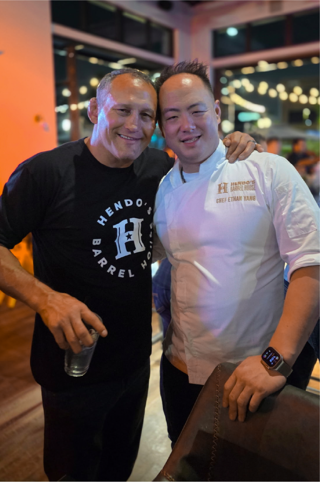
Photography by Keith Newstrom | Cutthroat Consulting & Marketing
Brand Identity | Hospitality | Temecula, CA
THE VISION
MMA legend Dan Henderson had already built a name for himself. Now he wanted to build something bigger: a hospitality destination combining food, drinks, entertainment, and his fighting legacy.
One name to rule a much bigger vision!
THE CHALLENGE
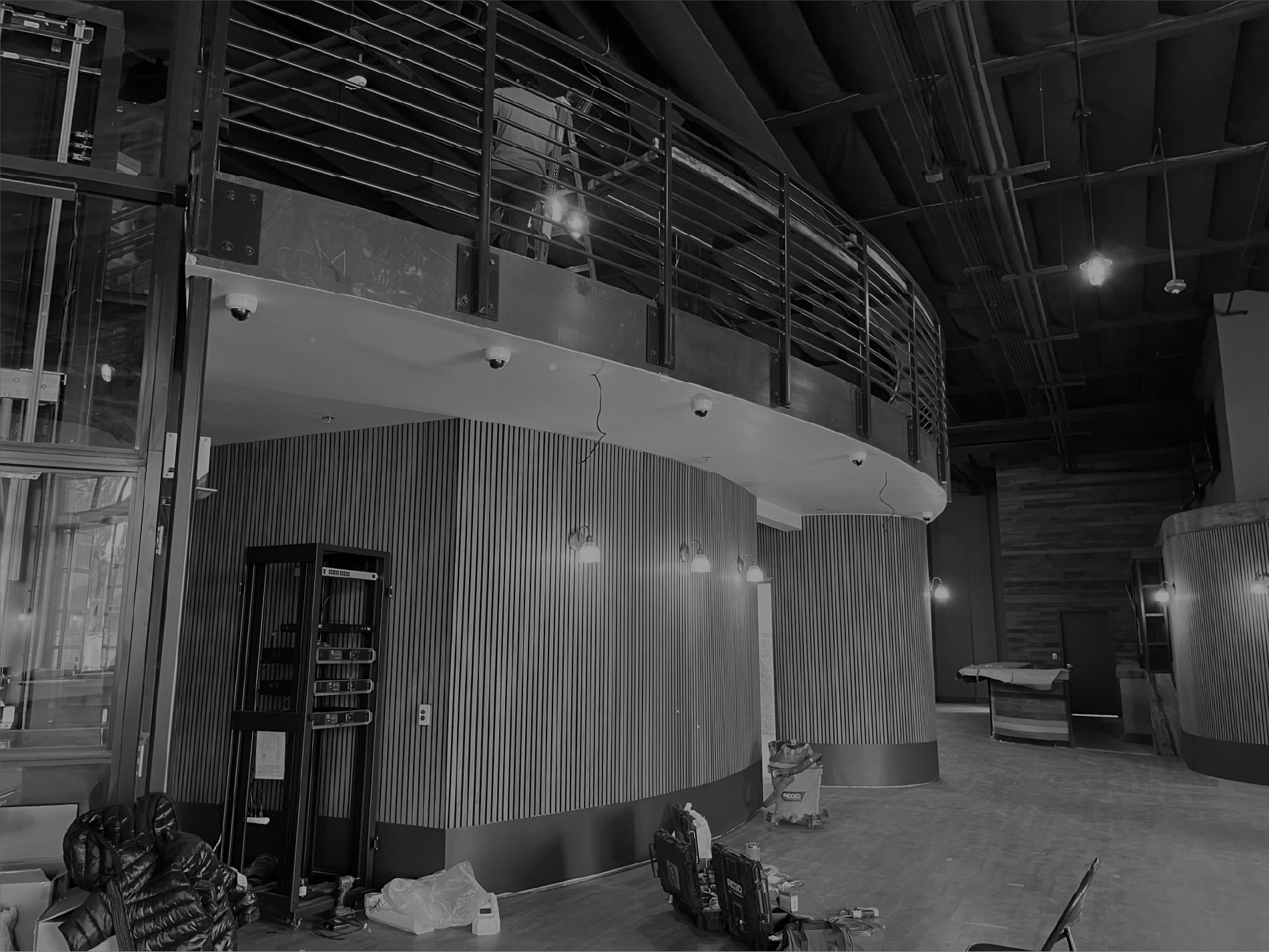
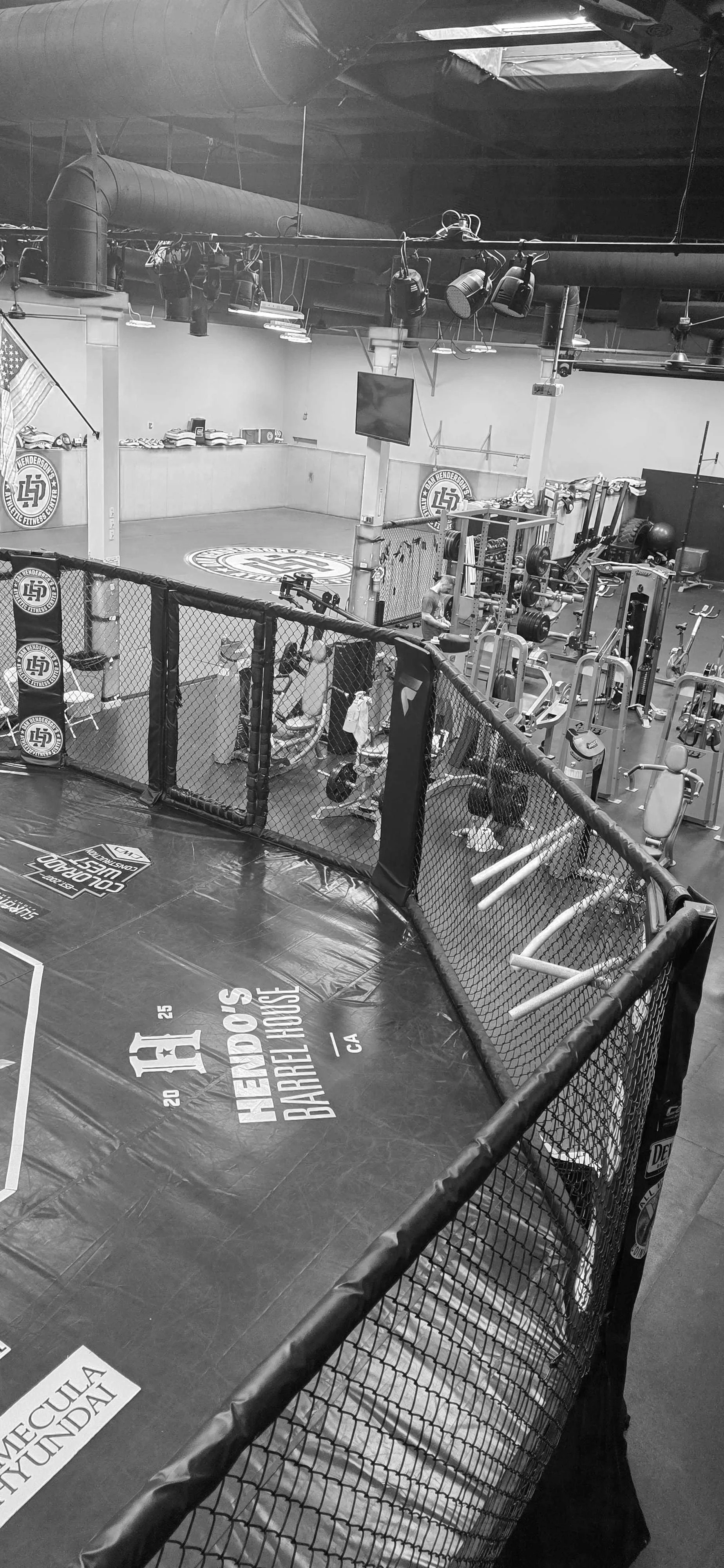
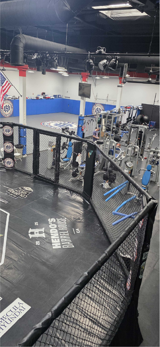
What started as a restaurant branding project quickly became something more complex. The vision included a 32,000-square-foot property with a steakhouse, brewery, distillery, smoothie bar, butcher shop, merchandise, and MMA training facility.
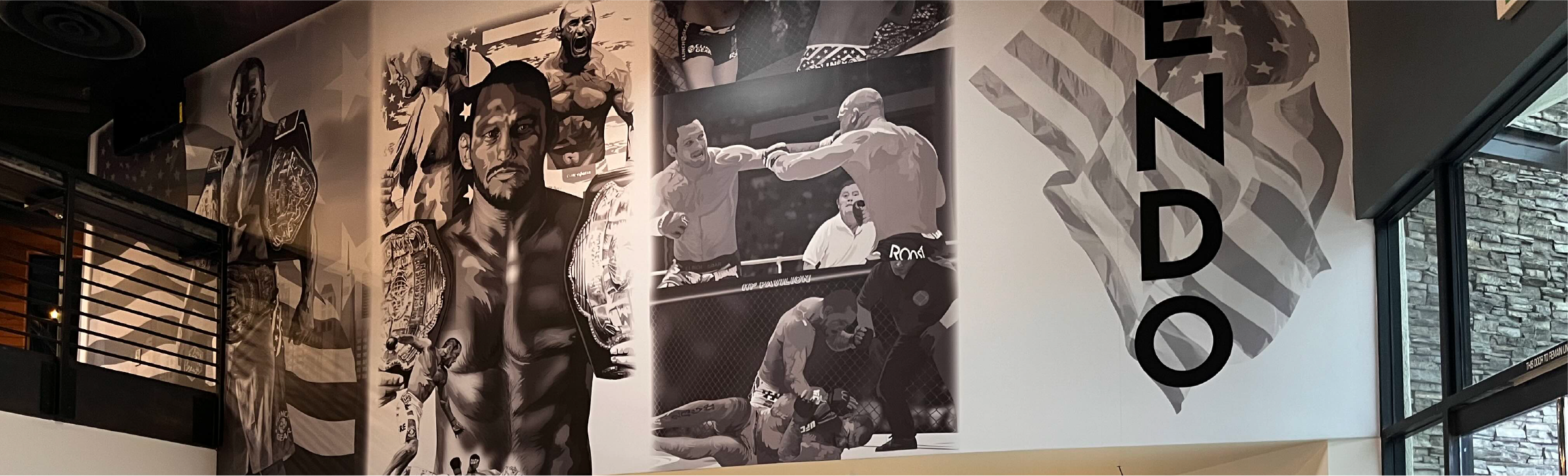
Dan already had a reputation and an established gym identity. The building also had existing interior design, murals, and décor to consider. We weren't starting with a blank canvas or looking to reinvent what was already there.
The challenge was creating an identity that could bring everything together and feel like it all came from the same foundation.
“How do you create one brand that feels right across several very different experiences?”
THE THINKING
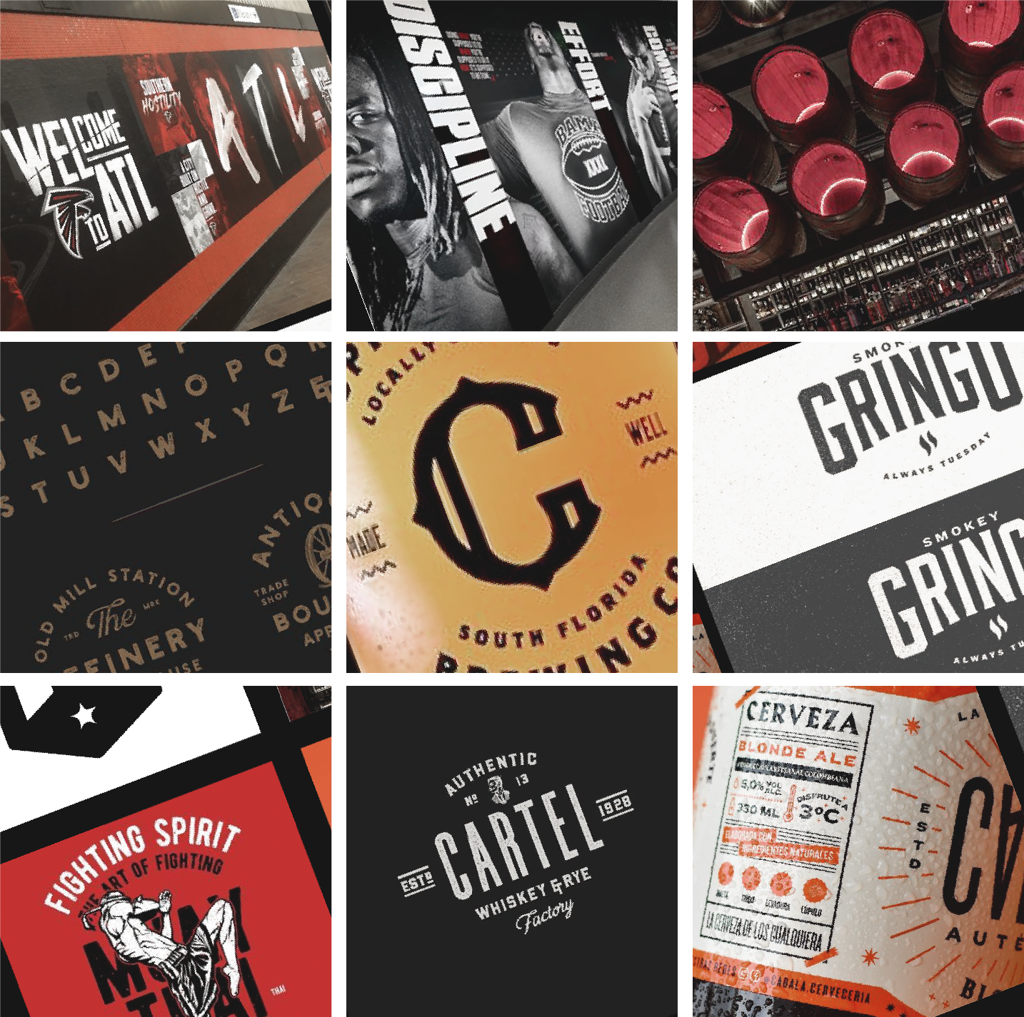
A typical MMA identity felt too loud or gimmicky for a premium hospitality destination. We wanted the energy of a sports bar without the obvious sports bar aesthetic. A traditional steakhouse identity, on the other hand, risked losing the bold personality behind Hendo's.
Through conversations with Dan and his wife, we found a direction rooted in patriotism, discipline, craftsmanship, and strength. The word "cowboy" came up, and it fit. Dan grew up on a ranch, and that grounded, hardworking character was part of who he was.
The goal wasn't to create an exclusive dining experience or another fight-themed bar. It was a place where people could gather, feel welcome, and have a kick-ass time.
EXPLORATION & RESTRAINT
With a name as bold as Hendo's, the identity needed something simple and strong enough to support it.
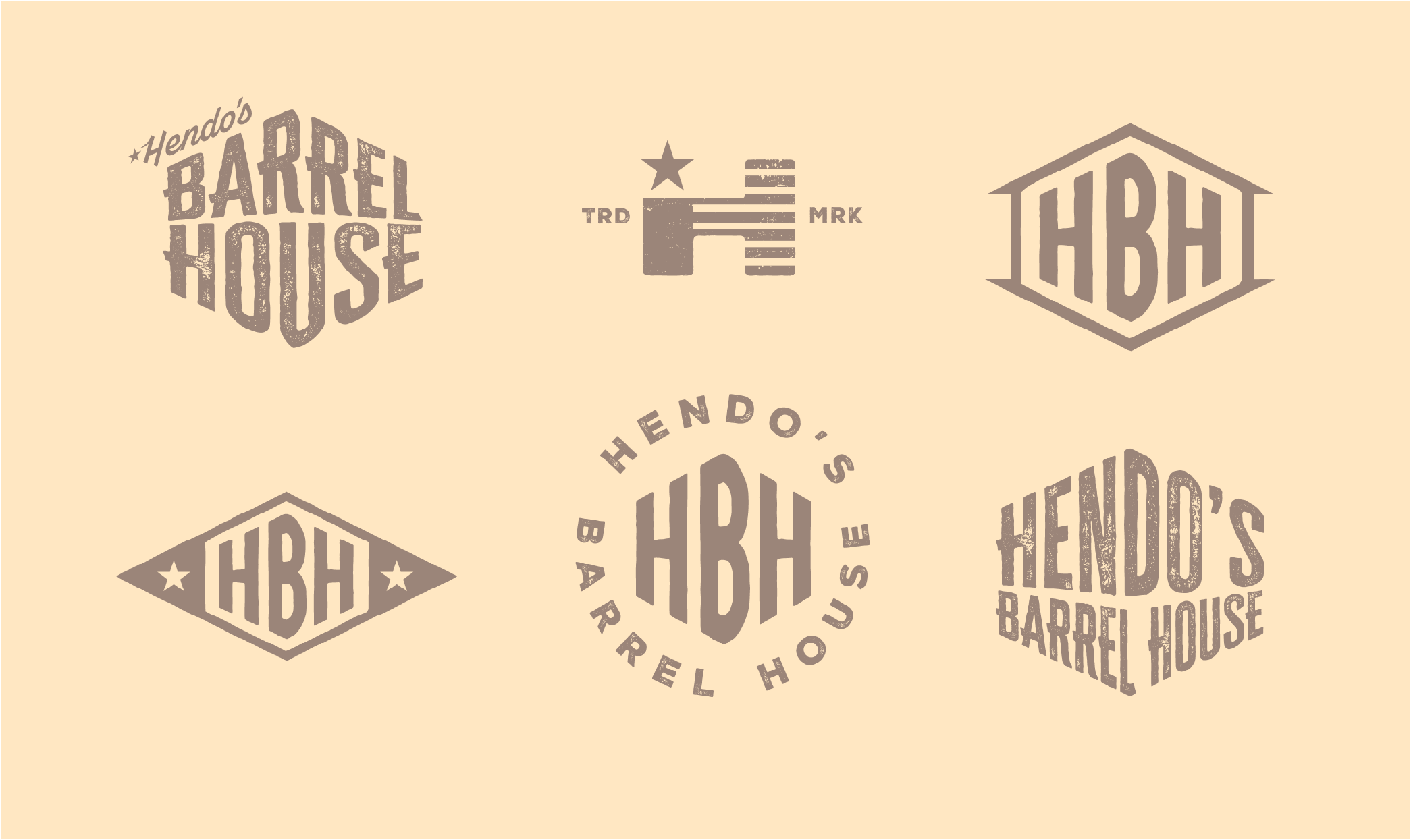
A standalone wordmark could work, but we also needed a recognizable symbol for smaller applications. Boxing gloves and wooden barrels felt too literal, and neither could represent the full business.
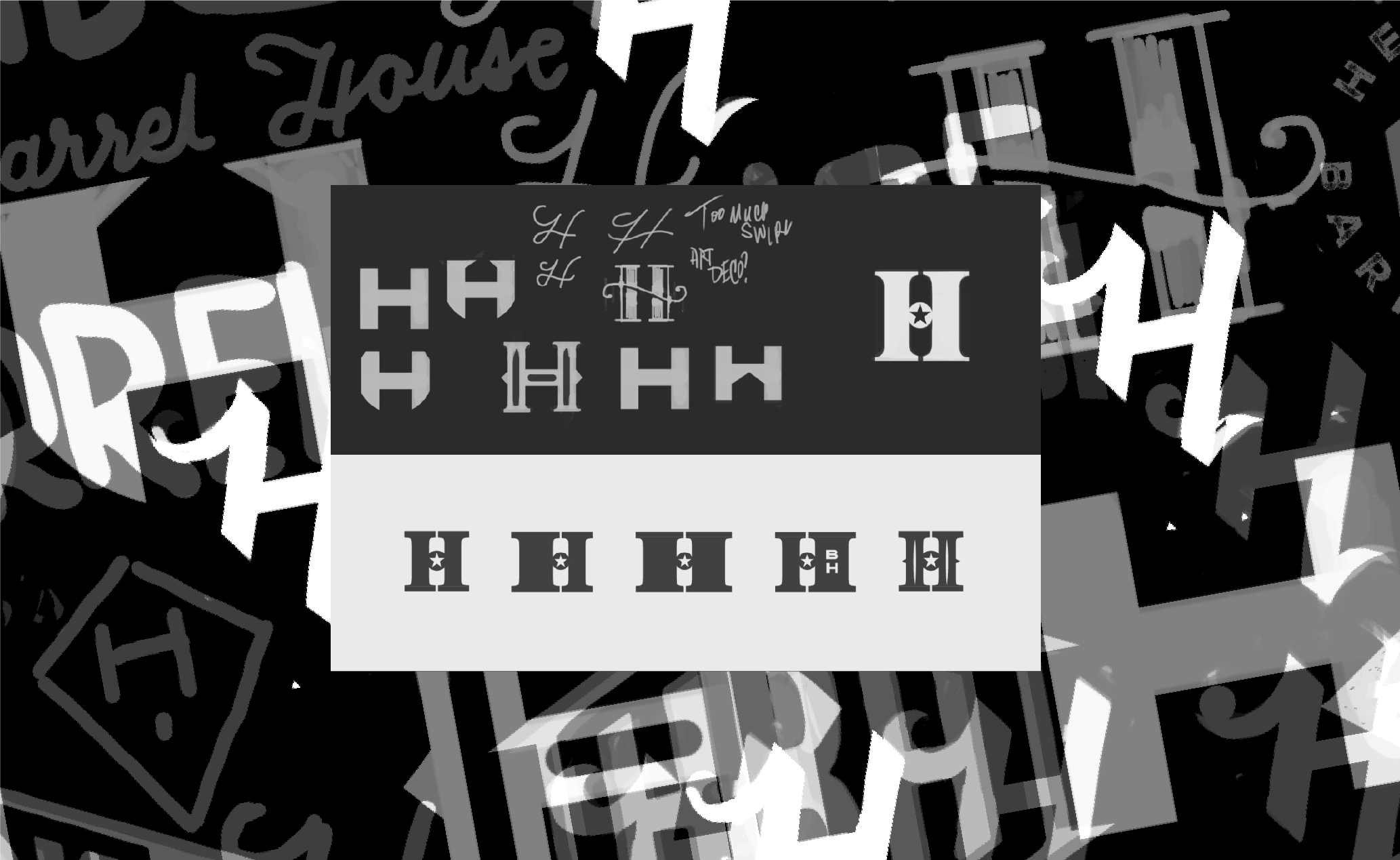
I explored different letterforms, including some script directions, before returning to a heavy slab-serif H. It had the strength of fight culture with enough character and refinement to belong in a premium dining environment.
During development, something unexpected emerged. The negative space within the H began to resemble a hanging punching bag.
It wasn't something I had planned. Rather than forcing a literal object into the logo, the connection appeared through experimenting with shape, curvature, contrast, and negative space.
THE IDENTITY
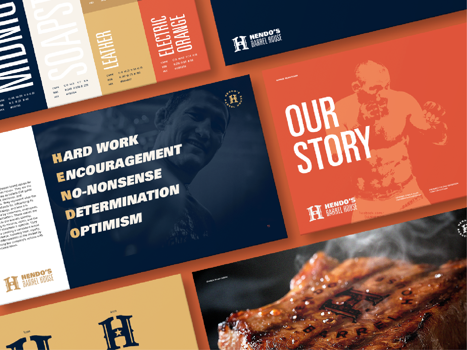
The slab H became the anchor of the identity, paired with Univers, a versatile sans-serif typeface.
While the H provided character and strength, Univers brought clarity and flexibility. Pairing the mark with another decorative serif could have pushed the identity too far toward traditional steakhouse territory.
Color followed a similar approach. Inspired by classic Americana, we kept the deep navy and warm neutrals but replaced traditional red with a bold orange. It brought energy, helped Hendo's stand out, and maintained that familiar American character without leaning too heavily into red, white, and blue.
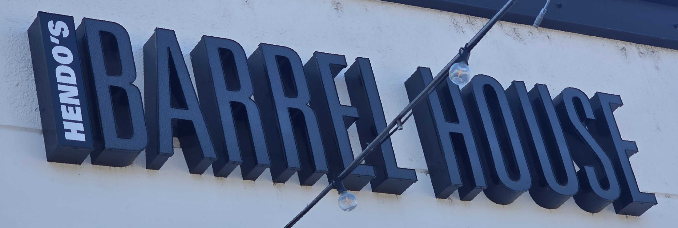
Together, these elements created an identity that felt equally at home on signage, menus, merchandise, and apparel.
Realistic mockups also played an important role. Dan could see how the identity worked in actual environments before making decisions, helping us evaluate the complete system rather than individual graphics.
“The conversation moved beyond whether someone liked a logo to does this align with the brand.”
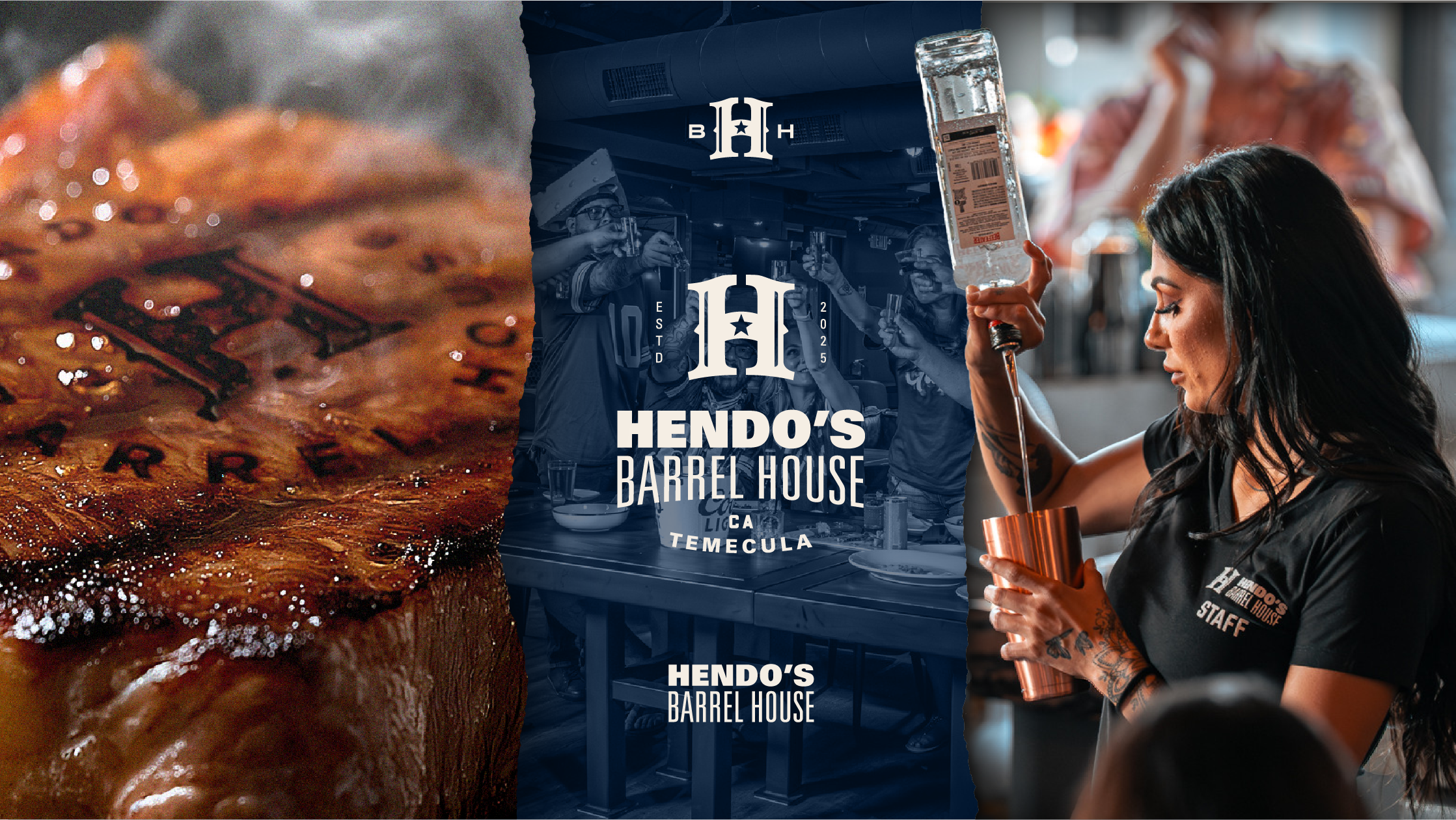
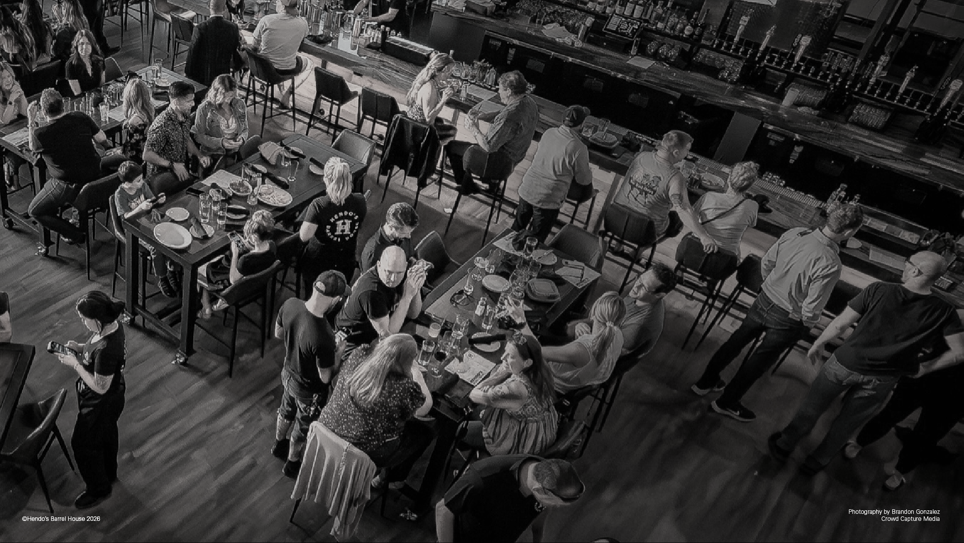
Photography by Brandon Gonzalez | Crowd Capture Media ©Hendo’s Barrel House 2026
OUTCOME
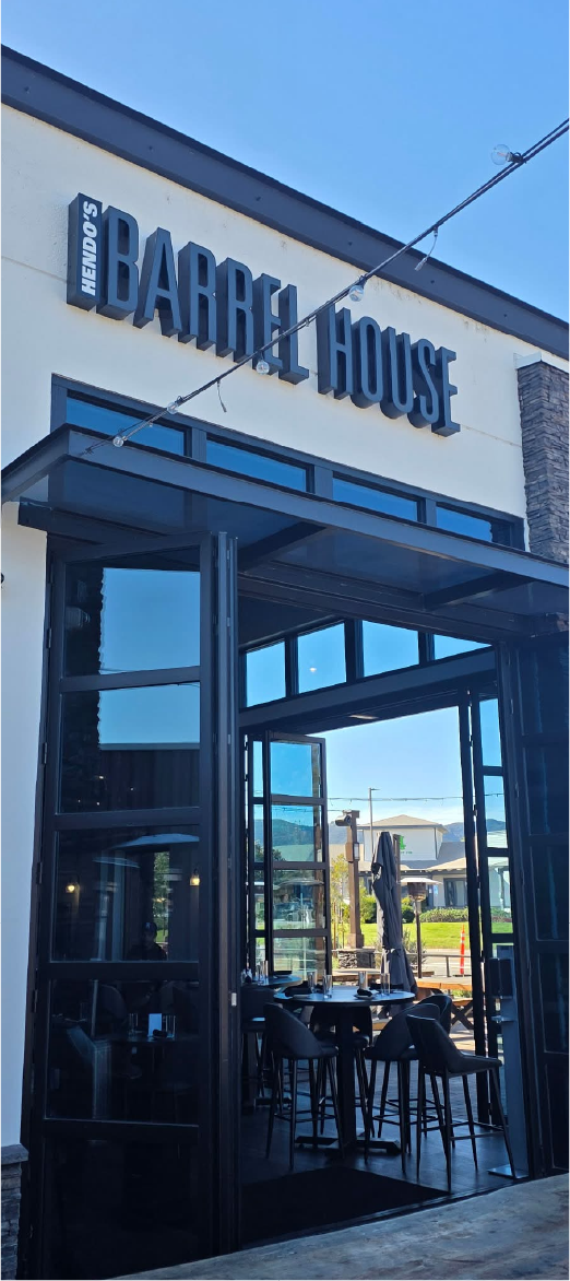
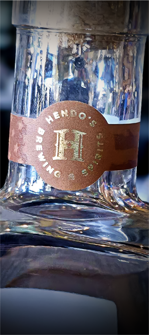
Over eight weeks, Hendo's gained a complete identity system, including a logo suite, brand guidelines, signage design, and applications across menus, uniforms, and merchandise.
The finished identity brought Dan's fighting legacy, ranch upbringing, and hospitality vision together without relying on the usual visual clichés. From the restaurant entrance to a hat or beer glass, the same personality carries through.
What began as several different business ideas became one visual language that could represent them all.
Photography by Keith Newstrom | Cutthroat Consulting & Marketing